Visual aids can turn a polymer science presentation from a dense stream of terminology into a clear, memorable explanation of how materials behave, why structures matter, and where research creates real-world value. In this Educational Resources hub on Educational Videos and Podcasts, the goal is broader than making better slides. It is to help students, instructors, lab leaders, and science communicators explain polymer concepts across formats, from lecture decks and conference talks to short teaching videos, narrated screen captures, and interview-style podcast episodes supported by companion graphics. In polymer science, visual aids include microscopy images, molecular structure diagrams, stress-strain plots, thermal analysis curves, process schematics, animation sequences, whiteboard drawings, sample demonstrations, and concise tables that compare properties or methods. Used well, these tools reduce cognitive load, show relationships that words alone cannot carry, and help audiences move from abstract chemistry to practical understanding. Used poorly, they overwhelm viewers with clutter, unreadable labels, or decorative images that distract from the scientific claim. I have seen both outcomes in classrooms, technical webinars, and conference sessions, and the difference usually comes down to planning for the audience first. If you are explaining crystallinity, glass transition temperature, copolymer architecture, rheology, or biodegradation, the right visual aid lets your audience answer the essential question quickly: what should I notice, and why does it matter?
This article serves as the central guide for Educational Videos and Podcasts within polymer science communication. It covers how to choose visual formats for different teaching goals, how to adapt graphics for recorded and audio-first media, and how to build reusable assets that support a family of related lessons. Because this page is a hub, it also frames the subtopics you should explore in deeper companion articles, such as designing lecture graphics, recording lab demonstrations, scripting educational video segments, creating podcast show notes with figures, and improving accessibility for technical media. The core principle is simple: in polymer science presentations, every visual aid should carry evidence, not decoration. A scanning electron micrograph should reveal morphology linked to performance. A DSC thermogram should identify transitions and support an interpretation. A synthesis route should clarify sequence and mechanism, not merely fill space. When visuals are selected and explained with that standard, audiences retain more, ask better questions, and connect foundational concepts to applications in packaging, biomedical devices, coatings, textiles, elastomers, and additive manufacturing.
Start with the learning objective, not the slide template
The fastest way to improve visual aids in polymer science presentations is to define the learning objective before opening presentation software or editing a video timeline. Ask what the audience must understand by the end of the segment. If the objective is to distinguish thermoplastics from thermosets, a simple network diagram paired with a reheating example is more effective than six bullet points. If the objective is to explain why molecular weight distribution affects processing, show a distribution curve and connect it to melt viscosity, die swell, or film uniformity. In my own teaching and training work, this step prevents the most common failure: collecting impressive figures that do not advance the argument.
Different objectives call for different visual forms. Conceptual understanding usually needs diagrams, analogies, and stepwise build-ups. Data interpretation needs graphs with clear axes, annotations, and a verbal explanation of trend direction, variance, and practical meaning. Process understanding needs flowcharts, reactor schematics, extrusion line layouts, or short demonstrations. Skill instruction, especially for educational videos, benefits from over-the-shoulder camera views, labeled equipment shots, and split-screen comparisons of correct versus incorrect technique. Podcast episodes often seem less visual by nature, but strong podcast teaching in science relies on planned companion assets such as episode graphics, downloadable figures, chapter markers, and linked glossaries.
When you build around a defined objective, your visuals become easier to sequence. A strong sequence often moves from macro to micro: everyday object, material type, molecular arrangement, property test, and application consequence. For example, in a lesson on polyethylene, begin with packaging film, move to branching differences between LDPE and HDPE, then show how density and crystallinity influence stiffness, transparency, and processability. This progression helps learners anchor an unfamiliar term to a familiar product.
Choose the right visual aid for the polymer concept
Polymer science includes several recurring concept types, and each type has visual formats that consistently work better than others. Structure-property relationships are best shown with side-by-side comparisons: linear versus branched chains, amorphous versus semicrystalline regions, random versus block copolymers. Kinetics and synthesis pathways benefit from reaction schemes, animated sequence builds, and timelines that show initiation, propagation, chain transfer, and termination. Mechanical behavior should usually be displayed with stress-strain curves, fracture images, and photographs of the specimen before and after testing. Thermal behavior is clearer when DSC, TGA, and DMA outputs are simplified and annotated rather than presented as raw exported plots.
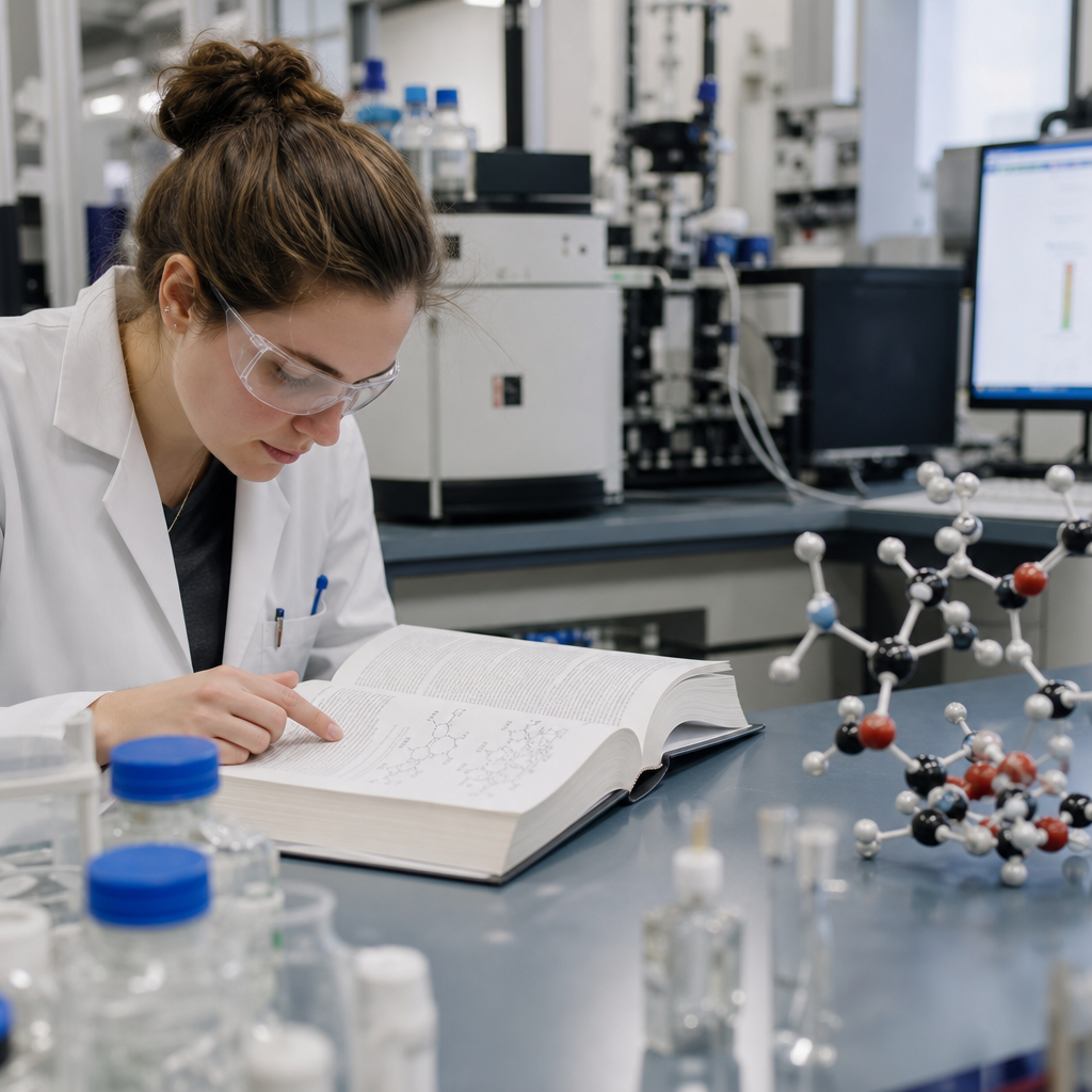
Microscopy images deserve special discipline. SEM, TEM, optical microscopy, AFM, and polarized light microscopy can be visually striking, but if scale bars, contrast, and labels are weak, audiences learn little. Always identify the imaging mode, magnification context, and the feature that matters. If a micrograph is included to show spherulites, voids, phase separation, fiber pull-out, or filler dispersion, say so directly on the slide or in the video narration. In live presentations, I often use arrows or a brief zoom-in sequence because many viewers are not trained to inspect material micrographs quickly.
Educational videos create opportunities that slide decks cannot. You can animate chain mobility above and below glass transition temperature, overlay narration on an extrusion demonstration, or cut between a rheometer display and a sample response. Podcasts require a different strategy. Since listeners may be driving or walking, the spoken explanation must stand on its own, but the strongest polymer podcasts still use visual aids through episode pages. A good episode on recycling PET, for example, can include a process flow diagram, contamination examples, and a table summarizing mechanical versus chemical recycling tradeoffs.
| Teaching goal | Best visual aid | Why it works in polymer science |
|---|---|---|
| Explain molecular architecture | Annotated chain diagrams | Shows branching, crosslinking, tacticity, or copolymer sequence at a glance |
| Interpret material behavior | Labeled graphs | Connects measured data such as modulus, viscosity, or Tg to performance |
| Show processing steps | Process schematics or short video clips | Makes extrusion, injection molding, curing, or electrospinning easier to follow |
| Compare materials | Property table | Highlights density, tensile strength, barrier performance, or thermal limits quickly |
| Teach laboratory technique | Demonstration video with overlays | Reduces ambiguity in setup, calibration, safety, and sample handling |
Design slides, videos, and podcast assets for clarity
Clarity in scientific visuals depends on hierarchy. The audience should see the claim first, then the evidence, then the detail. That means slide titles should state the takeaway, not just the topic. “Higher crystallinity increases stiffness and opacity” is better than “Crystallinity.” Graphs should have readable axis labels, units, and legends. Use color sparingly and consistently; if blue represents the neat polymer and orange represents the filled composite once, keep that convention throughout the presentation and all related educational videos. Consistency matters even more in a hub of Educational Videos and Podcasts, because learners may watch multiple pieces in sequence and rely on repeated visual language.
Recorded media demands additional discipline. A figure that works in a lecture hall may fail on a phone screen. For video, enlarge labels, crop unnecessary white space, and avoid tiny multi-panel journal figures unless you rebuild them. For podcasts, think in paired assets. A concise audio explanation of viscoelasticity becomes more useful when supported by a downloadable Maxwell-versus-Kelvin-Voigt schematic, a simple glossary, and timestamps that direct listeners to the exact section discussing creep or stress relaxation. These assets also make the content easier to revisit later, which is essential for technical learning.
Accessibility should be built in from the start. Use sufficient color contrast, avoid relying on color alone to distinguish data series, add captions to videos, provide transcripts for podcasts, and describe essential visual features verbally. If you say “as you can see here,” you have not taught enough. Instead say, “the blue curve shifts left, indicating lower thermal stability after plasticizer addition.” That sentence helps both sighted viewers and anyone using an audio-only format. It also forces the presenter to identify the real meaning of the figure.
Use real examples, data storytelling, and media workflows
Audiences remember polymer science when they can tie a visual to a practical problem. A lesson on oxygen barrier properties becomes concrete when linked to food packaging shelf life. A segment on hydrogels becomes clearer when paired with wound dressing images and swelling data. A discussion of PLA and PHA gains depth when you compare compostability claims with actual industrial composting conditions, crystallization behavior, and processing constraints. Real examples prevent visual aids from becoming isolated facts.
Data storytelling is especially important for educational videos and podcasts because these formats unfold over time. Instead of showing a complete slide full of results at once, reveal the setup, then the measurement, then the result, then the implication. In a polymer degradation lesson, begin with UV exposure conditions, show photographs of discoloration, then plot tensile retention over time, and finally connect the loss of performance to product lifespan. This sequence mirrors how scientists reason. It also helps learners reconstruct the argument later.
A repeatable workflow improves quality across a content hub. Build a shared asset library that includes polymer icons, color-coded material families, editable graph templates, standard units, and pronunciation notes for common technical terms. Use trusted tools: PowerPoint or Keynote for quick figure assembly, Illustrator for precise redraws, BioRender-style icon discipline when making process schematics, OBS or Camtasia for screen-recorded lessons, and Descript or Adobe Audition for podcast cleanup. For charting, Origin, Excel, Python matplotlib, and GraphPad can all work, but exported figures usually need simplification before teaching use. Journal-ready is not audience-ready.
Finally, test your visual aids with someone outside your specialty. In polymer science, experts often forget how quickly jargon accumulates. If a chemical engineering student cannot tell what your DMA graph is supposed to prove, revise it. If a first-time listener cannot follow a podcast explanation of copolymerization without opening the companion figure, tighten the script. The best visual aids are not the most elaborate. They are the ones that make the science easier to understand, easier to remember, and easier to apply in the next class, lab meeting, or research presentation.
Effective visual aids in polymer science presentations do three jobs at once: they focus attention, explain evidence, and support retention across live, recorded, and audio-first formats. Start by defining the learning objective. Match the visual form to the concept, whether that means chain diagrams for architecture, graphs for property data, microscopy for morphology, or short demonstrations for processing and lab technique. Design every asset for clarity with strong hierarchy, readable labels, consistent color use, and accessible narration, captions, and transcripts. Then strengthen understanding with real-world examples and a repeatable production workflow that serves your full Educational Videos and Podcasts library.
As the hub page for this subtopic under Educational Resources, this guide should inform every related article you build next, from slide design and lab filming to podcast companion graphics and accessibility standards. The benefit is straightforward: better visual aids lead to better comprehension, stronger engagement, and more credible polymer science communication. Review one existing presentation, video, or podcast episode today, remove every decorative element that does not teach, and replace it with one visual that makes the science unmistakably clear.
Frequently Asked Questions
What types of visual aids work best in polymer science presentations?
The most effective visual aids in polymer science are the ones that make invisible or abstract ideas easier to grasp. Because polymer topics often involve molecular structure, processing behavior, phase changes, viscoelasticity, crystallinity, and performance tradeoffs, presenters do best when they combine several visual formats rather than relying on text-heavy slides. Molecular diagrams are especially useful for showing monomer-to-polymer relationships, chain architecture, branching, crosslinking, copolymer arrangement, and how structure influences properties. These visuals help audiences connect chemistry to behavior in a way that spoken explanation alone often cannot.
Graphs and charts are equally important because polymer science depends heavily on interpreting relationships such as stress versus strain, temperature versus modulus, molecular weight versus viscosity, and crystallinity versus barrier performance. A well-designed graph can quickly communicate a trend, comparison, or mechanism. Microscopy images, spectroscopy outputs, thermal analysis plots, and processing schematics also add authority and clarity when they are introduced with context and simplified labels. For educational settings, animations can be especially powerful for showing chain entanglement, diffusion, glass transition, melting, curing, or deformation under load. In shorter formats such as educational videos, clips, or podcasts with companion visuals, these dynamic aids can hold attention while also improving comprehension.
Physical samples are another highly effective visual aid, particularly when explaining differences in flexibility, transparency, toughness, elasticity, or recyclability. Holding up a rigid thermoset beside an elastomer sample can make a concept instantly memorable. Instructors and science communicators should also consider process flow diagrams, lifecycle visuals, and application photos to connect laboratory science with real-world uses in packaging, medicine, automotive systems, textiles, and electronics. The best visual aid is not necessarily the most technical one. It is the one that helps the audience understand what matters, why it matters, and how the concept fits into the broader story of polymer behavior and application.
How can I explain complex polymer structures and material behavior without overwhelming my audience?
The key is to present complexity in layers. Polymer science can become overwhelming very quickly because many topics involve multiple levels of explanation at once, from molecular bonding and chain arrangement to morphology, processing conditions, and end-use performance. Instead of showing every detail immediately, start with a simple visual that establishes the main idea. For example, if you are discussing why one polymer is flexible and another is brittle, begin with a basic chain illustration that contrasts loosely moving chains with tightly crosslinked networks. Once the audience understands that structural difference, you can then add a second visual that introduces crystallinity, temperature effects, or intermolecular interactions.
Audience-friendly sequencing matters just as much as the images themselves. It is often more effective to reveal a diagram in stages than to place a fully labeled, highly technical figure on the screen all at once. Highlight one region at a time, use color intentionally, and guide attention with arrows, circles, or progressive builds. In a lecture deck or conference presentation, this can be done through slide animation or by breaking one idea into several slides. In an educational video, a step-by-step annotated graphic works especially well. In a podcast setting, where listeners may not always be looking at a screen, companion graphics should be simple enough to reinforce the spoken explanation instead of duplicating it.
Another strong strategy is to pair every technical visual with a practical interpretation. Do not just show a polymer chain arrangement; explain what it means for stretchability, heat resistance, transparency, chemical durability, or manufacturability. This translation from structure to consequence is what keeps the audience engaged. Analogies can help too, as long as they are scientifically responsible. Comparing entangled polymer chains to cooked spaghetti, for instance, can give non-specialists a starting point for understanding mobility and deformation. The goal is not to eliminate technical rigor. It is to control the pace, reduce unnecessary cognitive load, and make sure each visual contributes to understanding rather than confusion.
What are the best practices for designing clear graphs, diagrams, and slide visuals for polymer science topics?
Clarity should always come before detail. In polymer science, presenters often use graphs generated from real data, instrument outputs, or journal figures, but not every original figure is suitable for presentation. A graph that works in a paper may be too dense for a live talk or educational video. Start by simplifying. Enlarge axis labels, define units clearly, remove nonessential data series, and use line colors that are easy to distinguish. If you are comparing materials, make sure the legend is immediately readable and that the audience can tell what each curve represents without squinting. It also helps to title the graph with the conclusion, not just the variable names. For example, instead of “DMA Results,” use a title like “Higher Crosslink Density Increases Storage Modulus at Elevated Temperature.”
For diagrams, visual hierarchy is essential. Important elements should stand out first, secondary details second. This can be achieved through consistent color coding, font size, spacing, and selective emphasis. If you use blue to represent crystalline regions on one slide, keep that same convention throughout the presentation. If you use red to mark stress concentration points or reactive sites, use it sparingly and consistently. Avoid cluttered backgrounds, overly decorative icons, and blocks of text that compete with the main visual. In polymer education, a clean schematic of extrusion, injection molding, electrospinning, or polymerization often communicates more effectively than a complicated technical drawing packed with labels.
Good slide visuals also respect the way people process information in real time. One central message per slide is usually better than trying to teach an entire subsection of polymer chemistry at once. Use whitespace generously. Make sure microscopy images include scale bars. When showing spectra or thermograms, highlight the peak, transition, or region that matters and explain why it matters. If the audience includes students or non-specialists, define abbreviations such as Tg, Tm, Mw, PDI, or SEM directly on the slide at least once. Finally, test your visuals for accessibility. Use high contrast, readable fonts, and color combinations that remain understandable for color-blind viewers. A strong polymer science visual is not just accurate; it is easy to interpret quickly and confidently.
How do visual aids improve learning and engagement in educational videos, podcasts, lectures, and conference talks about polymers?
Visual aids improve learning because they reduce the mental effort required to translate abstract language into usable understanding. In polymer science, many of the most important ideas are difficult to imagine from words alone. Terms like amorphous domains, chain entanglement, stereoregularity, viscoelastic recovery, or interfacial adhesion can sound opaque unless they are supported by images, diagrams, or animations. When audiences can see a concept while hearing it explained, they are more likely to retain it, connect it to prior knowledge, and apply it later. This is especially valuable in educational settings where students may be encountering polymer concepts for the first time.
Engagement also increases when visuals help people see relevance. A tensile curve becomes more meaningful when paired with photos of a polymer film stretching or failing. A discussion of biocompatible polymers becomes more compelling when supported by images of medical tubing, implants, drug delivery systems, or tissue scaffolds. Instructors, lab leaders, and science communicators can use visuals to bridge the gap between theory and application, making the material feel less like isolated terminology and more like a real system that affects everyday products and emerging technologies. That practical connection is often what keeps audiences attentive across longer lectures or more specialized conference sessions.
The role of visual aids changes slightly by format, but their value remains high. In lecture decks and conference talks, visuals help organize the speaker’s narrative and guide audience attention. In educational videos, they can carry part of the explanation, making the content more dynamic and easier to follow. In podcasts, where the spoken word leads, supporting visuals such as episode pages, show notes graphics, or social clips can still reinforce core ideas and make the content more shareable. Across all formats, effective visual aids increase comprehension, improve recall, and create a more inclusive learning experience for audiences with different backgrounds, learning preferences, and levels of technical familiarity.
How can I make sure my visual aids are scientifically accurate while still being accessible to students, non-specialists, and mixed audiences?
Balancing accuracy with accessibility begins by identifying what the audience truly needs to understand. Scientific accuracy does not require presenting every exception, mechanism, or dataset at the same time. It requires that what you do present is correct, appropriately framed, and not misleading. For instance, a simplified drawing of linear versus crosslinked polymers can be entirely accurate for an introductory explanation, as long as you do not imply that real materials always behave in perfectly idealized ways. The presenter’s job is to simplify responsibly. That means preserving the core scientific truth while removing details that are not necessary for the learning goal of that moment.
One of the best ways to do this is to build visuals around clear conceptual questions. Ask yourself whether the audience needs to understand structure-property relationships, processing effects, testing methods, failure mechanisms, or applications. Then tailor the visual to answer that question directly. If you are speaking to a mixed audience of students, instructors, and lab researchers, consider using a “progressive depth” approach. Start with an accessible overview visual, then add technical layers only after the foundation is established. This allows non-specialists to